 |
(Photo: Davies + Starr) |
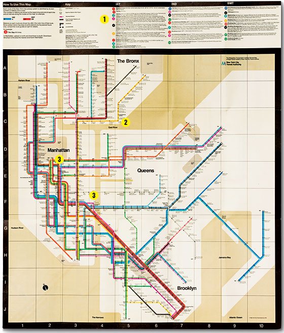
How to Use This Map
1. In 1972, personal computers didn’t exist, so the Vignellis’ mammoth subway project was done by hand. The project’s binder is thick with actual-size lettering indicating with nth-degree precision how each letter and symbol was to be shaped. (The arrow’s tip for exit signs is specified as four degrees.) The Vignelli MTA map is modeled on the London underground’s, where train paths follow a precise grid and there is no reference to ground-level topography.
2. The visual glory of the Vignelli map is its abstract simplicity: All lines bend at 45 or 90 degrees only. Every line has a color. Every stop is designated with a black dot, the corresponding negative of the colored circular signs on the actual platform.
3. As far as the Vignellis are concerned, they made two fatal mistakes: Central Park is a square, and the rivers are beige. Since the trains run underground, there’s no relationship to actual geography, Massimo Vignelli says. But everyone knows Central Park is rectangular and that water is blue. And so if you put them as something different, you instantly lose credibility.
According to them, the current map is even more of a disaster, loaded with confusing information, like the bubbles listing bus connections and topographical allusions. The couple wants another try at designing the map and to make it perfect this time.