 |
(Photo: Dean Kaufman) |
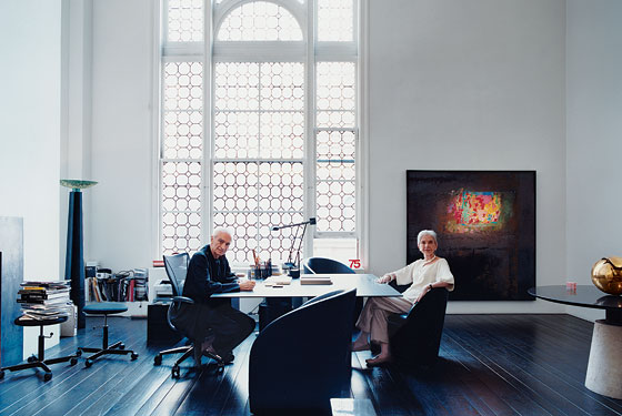
Massimo and Lella Vignelli have a saying: If you can’t find it, design it. And it’s not just a saying. In the living room of their Upper East Side apartmentone of those old-fashioned grand studios with coffered ceilings and a twenty-foot leaded-glass windowalmost everything of interest in sight is their own design, from the black leather chairs to the square steel worktable, the white porcelain coffee cups to Lella’s sleek silver choker and Massimo’s black cashmere Nehru shirt with the wire neck tab.
Peak: 1965 to 1985
Essential Design: New York Subway Signs and Map

How to Use This Map
But it’s one thing to customize your surroundings, quite another to have the kind of far-reaching impact these two Italian-born architect-designers have had over the past 30 years. They’ve created corporate identities for American Airlines, Bloomingdale’s, Ford, and Knoll, and designed such everyday household products as Heller plasticware, Fodor’s travel guides, and a version of the New York subway map. When he arrived in New York to work for the Vignellis in 1980, says Pentagram partner Michael Beirut, he was overwhelmed by their presence. You couldn’t travel around New York without encountering something by these two iconic, impossibly exotic characters.
As co-founder of Unimark International in 1965, Massimo established one of the earliest modern design-consultant firms devoted to the now-ubiquitous notion of creating across-the-board brand identities.
The most remarkable thing is their consistency, says Deyan Sudjic, director of the Design Museum London. There’s no sense of the passage of time. Their work is not trapped in a style.
The process is simple, says Massimo. It’s a matter of discipline, and it starts by looking at the problem and collecting all the available information about it. If you understand the problem, you have the solution. It’s really more about logic than imagination. In designing the logo for Bloomingdale’s, for instance, they knew they had to deal with a lot of circular shapes: o’s, a B, a d. So they stripped the feet off the letters, and made curves the logo’s main asset. They created the graphic language for the New York subway system in 1970 (it was unveiled in 1972), and while the black and white bars and brightly colored circles are still in place across the five boroughs, the accompanying map was in use for only five years. So beautiful no one could understand it, says Sudjic. The Vignellis would like another crack at it (refer to photo opposite).
If you do it right, it will last forever, says Lella. It’s as simple as that.
 |
(Photo: Courtesy of Massimo and Lella Vignelli ) |